A logo is like your calling card to the world. It identifies your company in a unique way and differentiates you from the competition. Done right, a logo will create a strong first impression and make you downright memorable. In other words, having a company without a logo is like wearing an invisible cloak. Nobody will be able to see you or even know you’re there!
For most companies deciding to get a logo is easy. It’s creating the logo that brings the many tough decisions with it. For example…
FORMAT
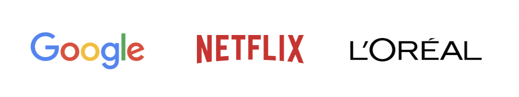
There are many formats to choose from when you’re putting together a logo. The one you choose should communicate something about your brand. If you’re a new business and want to get your name out there, a Wordmark or Typographic logo might be a good option. It’s basically the name of the company spelled out with a specific typeface. It says, “remember our name; it’s important!” It’s particularly good for technology-based products that don’t have a specific image attached to them.
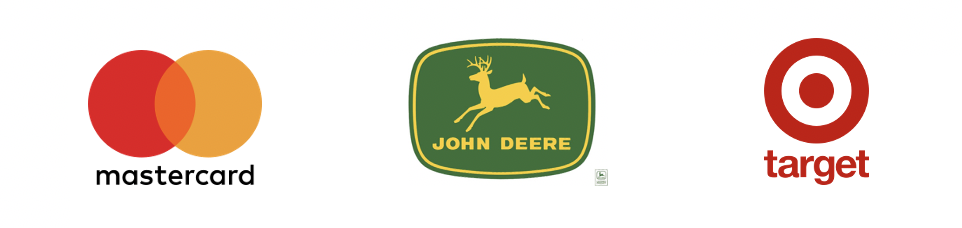
Or you could try a Combination logo that illustrates the name of the company, like the deer in the John Deere logo, or has little to do with it, like Mastercard’s abstract, intersecting circles. In these cases, the picture drives home the name of the company, or makes you wonder and starts a conversation. (Perhaps those rings on the Mastercard represent us and the credit card company working together for our purchases?) It’s a great choice when the related picture is simple, memorable and integrated well with the name of the company.
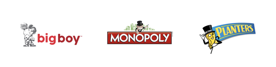
Character or Mascots are another fun way to go when designing a logo. While most people think of mascots as people dressed up as a character to entertain audiences, it is also a type of logo that can be used for branding. Combine the mascot with the text and they will become virtually inseparable in the consumer’s mind. Mascots are a great choice when you are trying to appeal to young families or children, and for companies that make regular appearances at events. The mascot is a truly memorable asset to have. Done right, you will be able to recall the name of the brand just from a glance at the mascot!
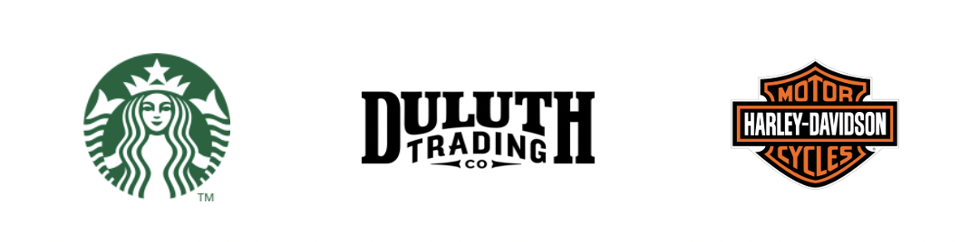
The Emblem or Symbolic is a style of logo that almost seems like a badge, or a rubber stamp. It is tightly constructed and typically contains several graphic elements, but the name of the company is still unmistakable. An emblem logo is a great choice for a more formal organization, or one in which badges, patches, stickers, or labels are heavily used. Emblem logos also look great on packaging.
The format of your logo is just the beginning of the decision making.
TONE
The tone of your logo should match your brand voice and also the audience you want to reach. How do you want them to see you? As a traditional company or a fun-loving, modern one? Do you want them to remember your stable past or look to you for future innovations? Do you want to appeal to a very conservative or very progressive audience? These are some of the questions your graphic designer should ask you before they sit down to create your logo. The more a designer knows about your company, its culture, and what you stand for, the faster they will be able to nail the logo design.
COLOR
Our brains are wired to see and interpret color. For years advertisers have known this and chosen their corporate colors purposefully. Different colors give off different subconscious meanings and are suitable for different occasions. For example…
RED is the universal symbol of love and passion. Only a brave, confident brand should have red in its color palette. It’s most appropriate for brands looking to present themselves as exciting, dynamic and emotional.
YELLOW is a friendly, cheerful color that exudes happiness and positivity. If that’s how you want folks to view your company, it’s a great choice for your logo. Just be sure the visibility of the logo is not lost against typical backgrounds used in the company, since yellow is such a light color.
GREEN has begun to slip more heavily into the logo color palette with the rise and concern for environmentalism. On a subtle, subconscious level, the color green is ecological and regenerative. Green is a great choice for brands that speak to ecology, fertility, and new birth.
BLUE is the color of the sea and sky, two places that lead us to dream and explore. Blue is a color that gives us confidence and hope, although it can also be interpreted as cool and detached. For all these reasons, blue is often a choice for larger, solid brands that want to exude stability and opportunity.
PURPLE. At JJR, we have a soft spot for purple, and it shows in our logo. Purple is the color of royalty, but is also a color commonly associated with spiritual awareness and luxury. As it is comprised of two primary colors, it subconsciously speaks to creativity and collaboration—two of our trademarks at JJR!
ORANGE. Formed from two attention-getters (red and yellow) orange hits our eye as something worth noticing. The combination of these two hues is energizing, and great for aggressive brands that also want to impact us in a positive, friendly way.
BLACK. Smooth, sophisticated, and easy on the eye, the black logo looks serious and authoritative. A black logo can make a powerful statement and just like a tuxedo or a black cocktail dress, it looks good anywhere!
WHITE is crisp, clear, and clean. White logos bring the challenge of always having to be on a darkly colored background to be seen, so it is best used by brands who will never use it or have it viewed any other way. Against black, they make a powerful statement and a positive reflection on your brand.
As you can see, the decision to have a logo is only the beginning. Design takes thought and decision-making, translated into creative interpretation that will serve the company well. If you’re ready for a new or refreshed look to your corporate logo, we can help. Call us today at JJR Marketing!