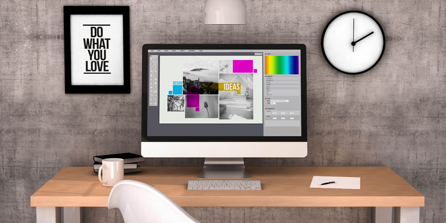
What to consider when putting together a design piece
Everywhere we look, design surrounds us, from the posts we see on our social media accounts to the advertisements and billboards we see when we’re driving down the street. Behind all of those designs is hours of planning and execution to make it happen.
We’ve curated a list of the important items to look for in a good design! What are some elements to pay attention to? Check it out!
A good graphic designer is born of education AND experience. While you may not have a graphic designer’s training or experienced eye, there are some things you should keep in mind as you put together your designs. They are known as the seven principles of graphic design.
 1. EMPHASIS
Experienced designers have a top down approach. In other words, what is it within the design that they want someone to see and notice right away? What needs to be emphasized in the design? Many tools can be used to provide this emphasis, from font choice to color and composition. Sometimes, a combination can be used.
2. BALANCE AND ALIGNMENT
We humans love a sense of order. Balance and alignment refers to placing content and images in a way that looks pleasing to the eye. Design elements carry “weight” based on the size of the element and/or its intensity of color. Placing too much “weight” at the top or bottom of the design will give it an unsettling, unbalanced look.
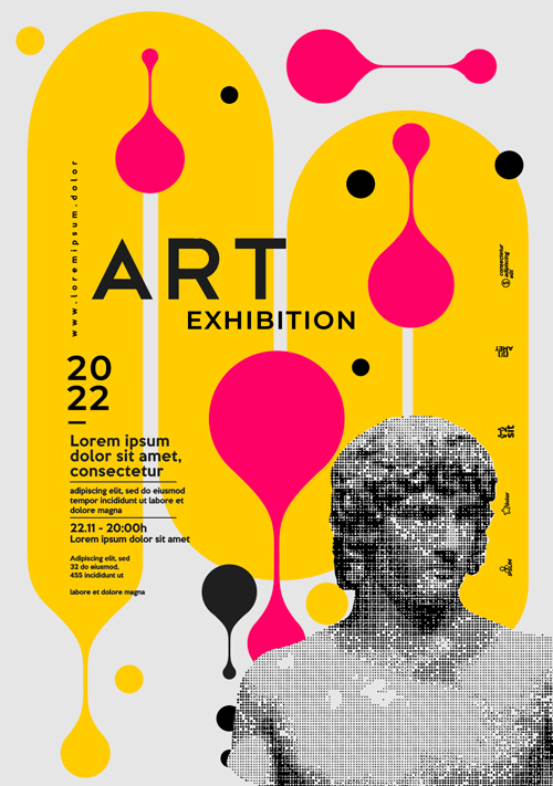
3. CONTRAST
Is it easer to read black on white text or yellow text on a light gray background? The difference lies in contrast. Contrast of color as used in design can call attention to certain elements and provide functionality. It helps with communicating your message by making the text within the design easy to read. The same goes for images. Setting them against the right background to have them pop or fade away is part of the art of design.
4. REPETITION
Repetition has to do with brand identity and creating designs that make sense for the brand. Most brands have defined style guidelines, including colors and fonts. Repetition in design is anything but boring. It’s a way to identify the design as originating from the brand precisely because of the elements used.
5. PROPORTION
Proportion describes the relative size of one part of the design with the others. A design that is in proportion creates equanimity with the person viewing it. All the pieces appear the size they should be. As for the final design, it just looks right!
 6. MOVEMENT
This element refers to figurative, rather than “actual” movement of the design. Design with movement helps us navigate the design with our eyes. The design keeps our eyes in motion, perceiving the various parts of the design as intended, all with the ultimate aim of providing excellent communication.
7. WHITE SPACE
And the seventh, and final, element of graphic design is white space. White space is not the amount of white that appears in the design. Rather, it is that special area in which the elements move. White space provides “breathing room” for your images and text.
Designs without enough white space will feel crowded and overwhelming. Proper use of white space positions the information you need in an easy-to-read, inviting way.
Any way you slice it, putting together a design with all seven of these elements is a challenge that can best be tackled by a professional graphic designer, but assessing these elements will help you recognize good design!